The task
My role involved designing a seamless booking app that integrates their new signature home-delivery service.
My role involved designing a seamless booking app that integrates their new signature home-delivery service.
The Challenge - Defining how to translate a "luxury" physical service into a digital interface.
The Solution - How the "Home Delivery" flow works, reducing friction and maintaining a premium feel.
User Research - Insights into what high-net-worth individuals value (e.g., speed, exclusivity, "no-touch" service).
Visual Design - Using typography and imagery that reflects the Miles & Miles brand identity.
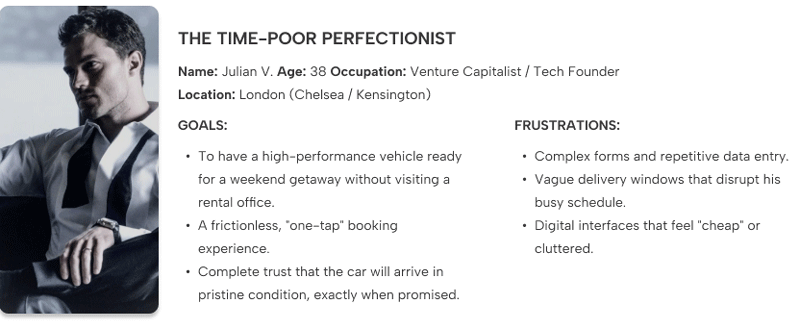
User Persona - To ensure the interface resonated with a high-end clientele, I developed a User Persona focused on the 'Time-Poor Perfectionist.' This allowed me to map out a user journey where convenience is the ultimate luxury.
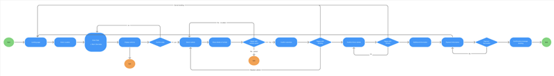
User Journey - I mapped the end-to-end user journey, studying the actual booking system on the client website, to identify potential friction points. Visualising the user’s emotional state at each touchpoint allowed me to refine the 'happy path' into a seamless experience.
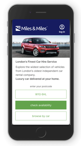
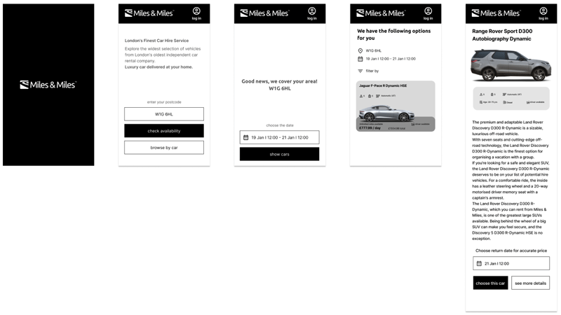
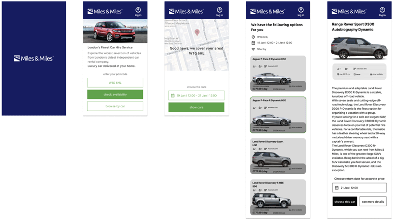
The Solution - To address Julian’s need for speed, the app features an instant availability check. By entering their address first, users immediately know if the service covers their area. Once dates are confirmed, the app skips the clutter and presents a curated selection of available cars, making the booking process effortless.
Low-fidelity wireframing - I began by designing low-fidelity wireframes in grayscale. This allowed me to focus entirely on functionality and user flow without being distracted by visual aesthetics, ensuring the foundation of the app was intuitive and logical.
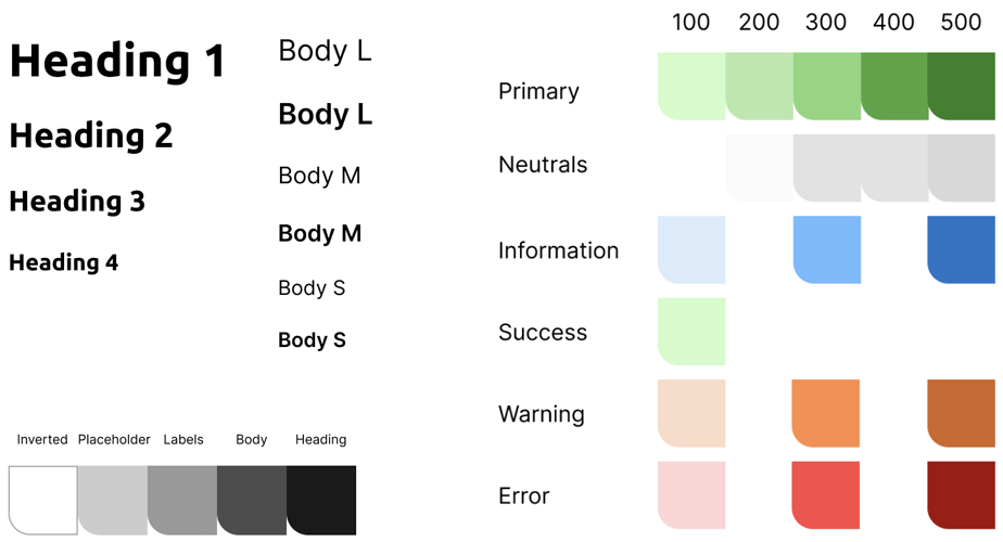
Styleguide - I selected a typographic hierarchy that balances elegance with legibility. I retained the Miles & Miles signature colour palette but refined its application, using deep tones and generous white space to create a 'high-end magazine' feel that elevates the overall digital experience.
Wireframes - My goal was to create a clean, sophisticated interface that felt like a natural evolution of the Miles & Miles brand. I maintained the core visual of their website while introducing a more polished aesthetic.
What I learned - Coming from a traditional design background, understanding the complexities of the user journey was my greatest challenge. I initially found it difficult to step away from the visuals and focus purely on the user’s flow. However, through competitive benchmarking, analysing established apps, and engaging in collaborative critiques with my classmates, I learned how to build a 'flawless path' that prioritises the user's needs.
Prototyping was a revelation in my process. Moving from static screens to an interactive flow helped me immediately identify usability issues that were invisible in the wireframe stage. This iterative process allowed me to refine the experience quickly, ensuring that the final design wasn't just beautiful but truly functional.